![]()
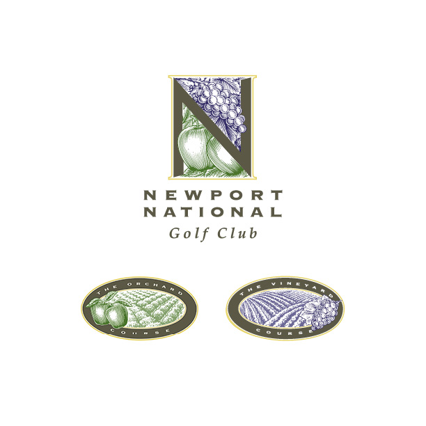
When envisioning golf, the ubiquitous silhouette of a golfer in mid-swing often dominates our thoughts. Breaking away from this clichéd perspective became the focal point in crafting an identity system for Newport National Golf Club, one that would stand out and captivate potential club members. Venturing onto the grounds during the intensive research and development phase, we discovered the remnants of an apple orchard and a vineyard, hidden gems within the property. This discovery sparked a creative idea – to name the courses in alignment with these features and develop imagery that would set Newport National apart in the golfing landscape.
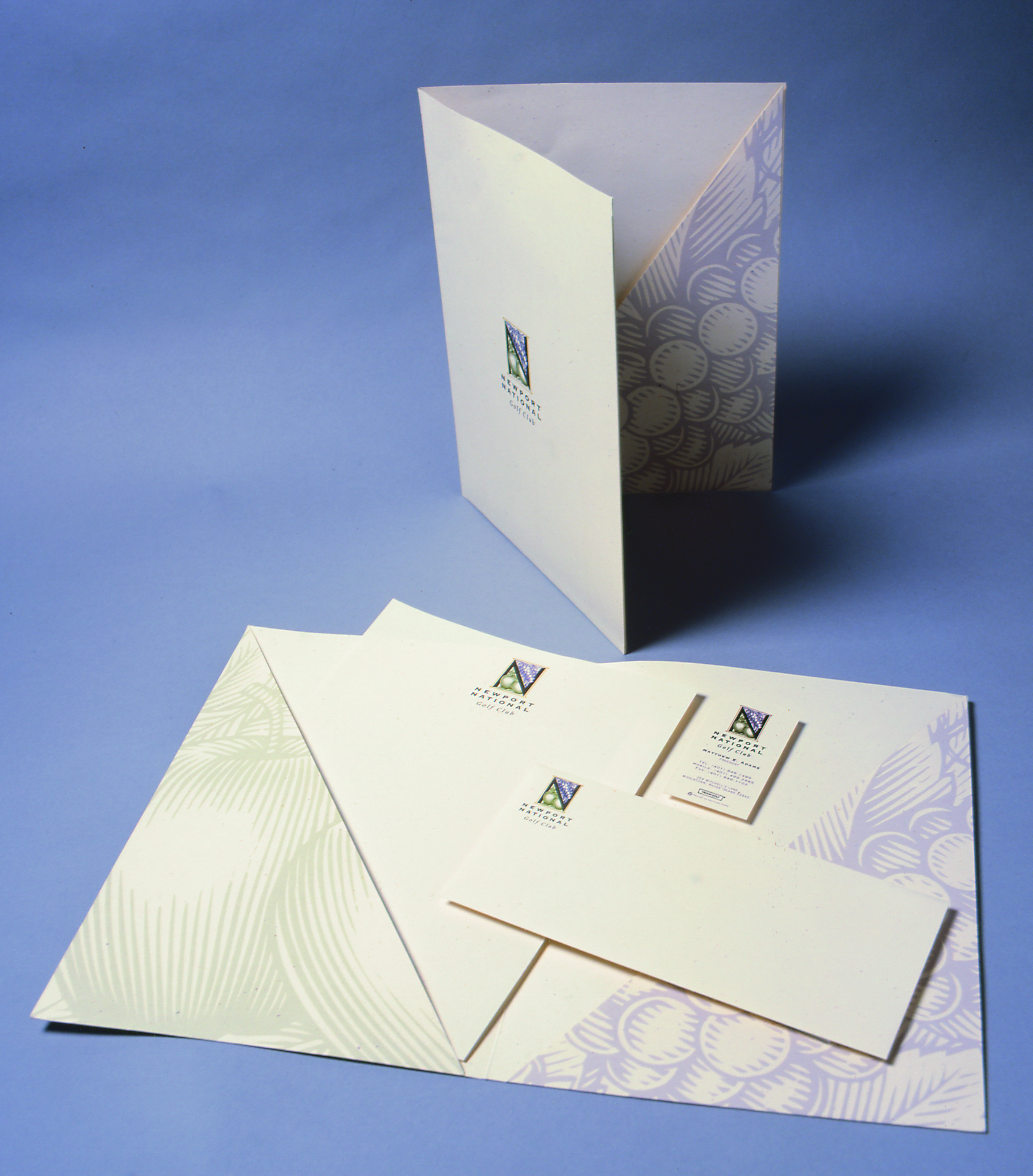
To infuse the identities with a desired upscale ambiance, we enlisted the expertise of an illustrator skilled in woodcut drawing techniques. This deliberate choice aimed to evoke the sophistication reminiscent of a fine wine label. The result was a collection of custom drawings that became integral elements in shaping both the corporate and course logos. These distinctive illustrations were seamlessly woven into the fabric of Newport National’s communication materials, establishing a cohesive and visually compelling brand identity.
By embracing the unique features of the property and leveraging the talents of a skilled illustrator, Newport National Golf Club successfully moved beyond the golfing cliché. The brand now exudes an elevated and distinguished aura, setting it apart in the competitive realm of golf club memberships.