![]()
The brand of Providence Water Supply was in dire need of a refresh, appearing outdated and lacking effective communication to the public.
As a crucial agency serving over 600,000 Rhode Island residents, accounting for nearly two-thirds of the state, it was imperative to bring this vital entity into the 21st century.
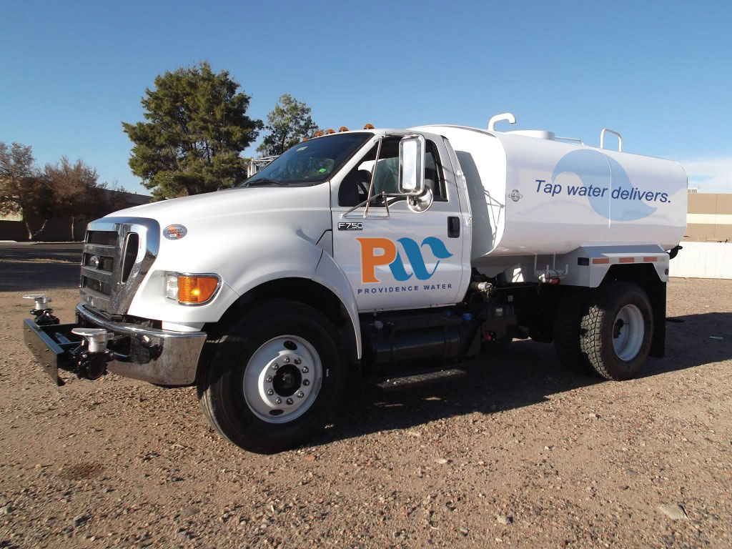
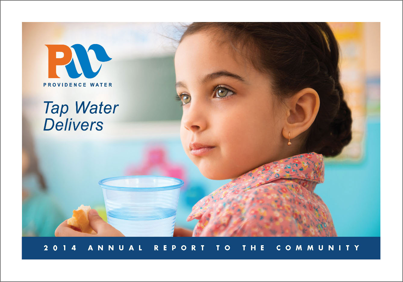
The task of rebranding fell into the capable hands of Leonardo Design and DK Communications. Together, they crafted a new logo that not only projected the image of Providence Water Supply on various mediums such as work vehicles, construction apparatus, uniforms, website, communications materials, and social media platforms but also ensured it resonated with the public. By incorporating the well-known orange “P” into the logo design, the agency now stands readily identifiable with the city of Providence. The sleek, modern, and visually appealing new logo serves as a symbol of the agency’s contemporary identity.
Beyond the logo, Leonardo Design and DK Communications extend their collaboration to produce the agency’s annual reports, all collateral, and other creative needs. Their effective partnership extends to close collaboration with top-tier personnel at Providence Water Supply and colleagues within Providence City government, ensuring a cohesive and impactful representation of this vital agency.